Monday, January 23, 2012

Re-sizing Images for Printing and Online Sharing

This post is directly linked to the products I offer in my online shop at http://phoenixdesigns.bigcartel.com/.

My digital shop doors opened just yesterday and I already had a bunch of questions regarding the size and resolution of the storyboard templates. So naturally I figured this topic would make an interesting and helpful blog post!

The templates I sell generally come in 300dpi and in large sizes, so they can be printed (even on big canvases) or used online (which requires re-sizing).

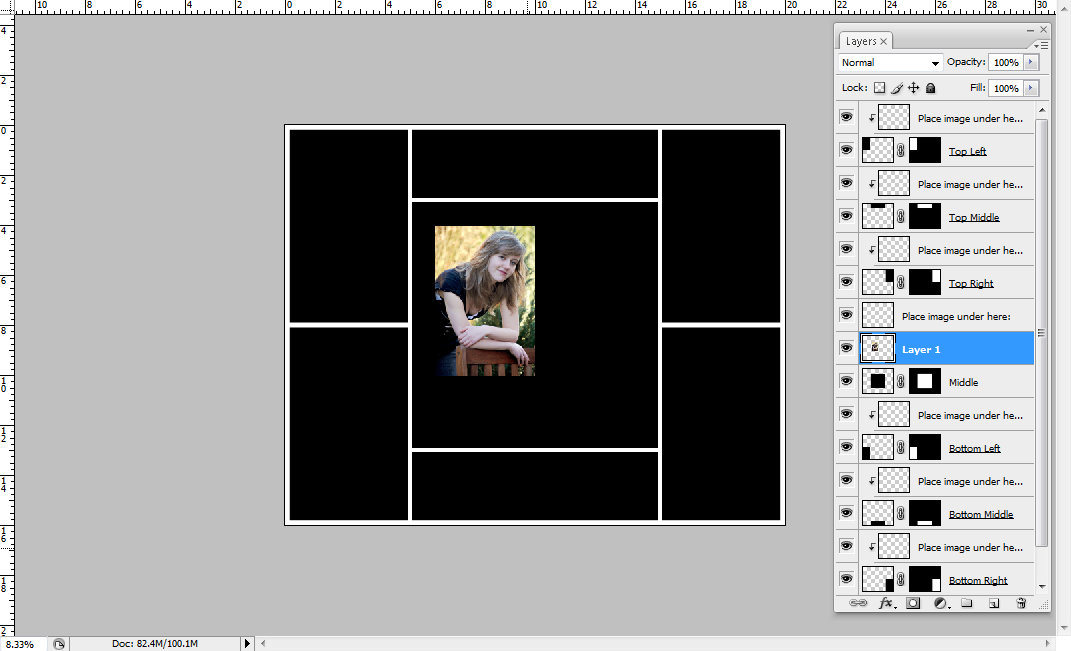
Let's take this template, for example, that I named "Jane" after my favorite author.


At the moment it has the following dimensions:


You can easily get to this menu by clicking the IMAGE tab and then choosing IMAGE SIZE. When you open it, yours might look a little different, because Photoshop lets you see the dimensions in inches, pixels, centimeters, and so on. By clicking the little arrows on the side you can make your selection. Let's go with pixels and inches for now. So now we have the width and height in inches, the resolution in pixels per inch, and the width and height in pixels, which is based on the resolution. If you change the resolution, the amount of pixels will change as well. 

Before splitting up the process for printing and online sharing, let me mention the three options at the bottom. When re-sizing your image or template, you definitely want all three selected and therefore the chain image visible next to the width and height. Why? Because you want to keep the proportion of your image/template:


That means that a 4x6 image should always have the same ratio. It can be 2x3, 1x1.5, 8x12, but you can't turn it into an 8x10 without cropping (which will be a totally different blog post). So for now let's just agree that we want to keep the proportions and re-sample the image, and therefore keep the three options in the menu selected.

Printing
If you want to print your photography templates (which may or may not be purchased from me) or images in general, you definitely want to check your image size. High-Quality photographic images should be printed at 300 pixels per inch (often abbreviated with ppi or dpi - dots per inch, which is more or less the same). 240 if you absolutely have to, but no less. Once you are finished adjusting you resolution (if you have to), check your dimensions. If the image is now only 4x6 inches, that's the biggest you can print. If the image is now 16x20 inches, you can print it in that size or smaller. You don't have to change the size for printing smaller at all, the lab will do that for you. But you can if you like. For practice, let's make the image 4x6 inches. Click OK. See what happens? The entire image and every layer (if you have any) have been re-sized while maintaining all proportions. 

Online Sharing
If you want people to be able to download your high resolution image, then follow the PRINTING instructions. If you want to share your image online and want to make sure no one can steal and then print it without paying you or getting your permission, then you're in the right place!

First of all, let's protect your image by lowering the resolution to 72, which is the maximum screen resolution. You won't notice a difference even if the resolution is any higher. Higher resolution images are just bigger, take longer to up-/download and therefore cause a webpage to load slower. Once you have done that, let's look at the dimensions of the image.

My computer screen at the moment is 1366x768pixels. So you don't need to post images any bigger than that, people can't see beyond their screen anyway and bigger sizes mean better quality (well, usually) and more risk to have your image stolen. If the longer side of the image is 960pixels, then that is plenty. So look at your Image Size menu. How many pixels are there, width and height? Pick the larger number and replace it with 960 (or a smaller number if you like). Click OK and you're done! Your image might seem tiny now, but it's just zoomed out. Zoom it in to 100% and you'll see that it is still big enough.

Saving
When you are ready to save your image, make sure you don't override your original template/image file. Click on FILE and then SAVE AS. If you want to keep working on the file later, save as a psd file to keep the layers. If you are ready to upload or print, save as a jpeg (which flattens the image and makes one layer out of many).


There is ONE MORE THING I'd like to mention. Let's say you just opened a template and you added an image, but it looks like this:


What now? Well, the template is obviously way bigger than the image. Unless you have a higher quality version of the image, you need to take the image out and re-size the template before using it. Right now, the template is 16x20 inches. You can re-size it using the methods explained above. 8x10 inches would be a good idea in this case, because it's still a standard print size. Or already re-size it for use online. When you are done, place the image again and now it should fit!


Does all of this sound very complicated and like a long process? Do it a couple of times and it will take all but 10 seconds. Promise.

Thursday, January 19, 2012

How to Make Fabric Banners

One of the things I love about Photography is the amount of props I get to purchase, create, and play with! After all, who doesn't like to go shopping for cute little accessories? All crucial for business, of course. Over the past few months I've made a large variety of fabric banners that are great as props, but could also be used for home decoration or for parties. So this is a tutorial for just about anyone! You can even use any type of fabric. I've made banners out of jeans before! Just a warning, though, anything stretchy or silky, like brocade for example, is going to be a pain. Try Quilting Fabric first.

The banner I am making will have 7 flags and be reversible. And because I always like to save time and money, I will give it different fabric on each side, so it can be used for different occasions just by flipping it over. 

What you will need is a sewing machine, very basic sewing skills, a bit of fabric (4 different kinds in this case; 1/4 yard each is plenty), pins, a bit of cardboard, about 6feet of 7/8inch grosgrain ribbon, a ruler, scissors, and a pen. It'll probably take about 2 hours to make your first banner, but it'll be faster with practice. Plus, you can do it in front of the TV. Prevents me from eating chocolate and potato chips.

Step 1: Make a Template
First of all, you will need to make a triangle out of the cardboard in the shape and size that you want your individual flags to be. Draw a straight line, envisioning the top part of your flag. Now find the middle point and move it down until the triangle looks according to your taste. Make a straight line from each end of the first line to the mid-point and voila, you have your template! Well, after cutting it out, that is.


Step 2: Iron your Fabric
Let me start this step by mentioning that I don't like ironing either. However, it'll help a great deal and after messing up my first attempt at making a banner because I was too lazy to iron out the fabric, let's just say I'd recommend it. With steam, until it is nice and smooth.

Step 3: Cut the Fabric
Now you can use your cardboard template to trace triangles onto your fabric. I like to start right at the edge and flip the template 180 degrees for each new triangle, just to save fabric. For this particular banner, I created 4 purple, 4 blue, 3 orange, and 3 zebra triangles. Aren't you glad already that you ironed the fabric? Anyway, cut out all of the pieces and now we are almost ready for sewing!


Step 4: Interfacing (optional)
Since most of my photography sessions are on location, I usually add interfacing to my fabric. It prevents the banners from being see-through and flapping too much in the wind. You can get iron-on interfacing from any fabric store cheaply. You roughly cut it out in the shape of your fabric, press the rough side of the interfacing against the wrong side of your fabric and iron it on. You can do it on all of your triangles, but I usually use one layer of interfacing for two fabric pieces that go together. For example, my banner will have purple and zebra on one side and blue and orange on the other. So now the interfacing will go only on zebra and purple fabric or on orange and blue, but not on both.

Step 5: Sew the Fabric
Now we're ready to sew this thing together! Pick two pieces of fabric triangles and place them on top of each other, so their right sides are pushed together and the left sides are visible. I picked zebra and blue here, because I want the banner to be zebra on one side and blue on the other. Next to ironing, pinning is the other thing I am generally too impatient to do, but even I can add one pin horizontally and one pin vertically to keep the fabric in place while sewing. Now sew the two sides of the fabric together, but not the top side where the ribbon will go. As you can see, I start at the top, sew all the way down, then all the way up and finish.


Step 6: Inside out and... Iron
You can now remove the pins and turn the triangles inside out. A pen or a pair of scissors can be very helpful when trying to push out the bottom edge. You will notice that the fabric is pretty bulky and doesn't lay flat, so we will have to iron it again. I know, trust me, but it'll be worth it. The scissors are a good tool to use to make sure the fabric is straight and exactly on top of each other when ironed. When you're done ironing, you can cut the yarn hanging out of the part of the triangle that isn't sewn yet and create a clean straight line.


Step 7: Add Ribbon
Almost done! All you have to do now is add the ribbon to the top! I have found that the cheapest grosgrain ribbon (you can even get it at Walmart) works best, because you can fold it and it won't immediately flatten itself again. That makes the process a lot easier. You can use satin as well, just know that it'll require more pins. Mine is cut to be 6feet long, which is just a personal preference. Also, ribbon often comes on spools with 18feet of ribbon on it, so picking 6feet enables me to create 3 banners total out of a spool. Find the middle of the ribbon at about 3feet and place your first fabric triangle right on it. Flip the ribbon over the triangle so that an equal amount of ribbon covers each side of the fabric and pin it. 2-3 pins should be enough.


Now add all your other fabric pieces to the left and right of that first middle piece. On each end, some ribbon will be left to hang the banner up later. Doesn't it look great already? You are ready to sew the ribbon! Try to pick yarn in the same color as your ribbon. Little irregularities will be much less visible. Now sew along the ribbon, as close to the edge as possible. When you're done, cut all yarn ends off and get a lighter. Very briefly hold each end of the ribbon into the fire. The ribbon melts and gets sealed that way, so it won't unravel.

DONE! Hope you like your Creation!


Monday, January 16, 2012

7 Most Basic Photography Editing Steps

Every time I edit a picture I find myself repeating the same basic steps before I enhance the picture with more customized little tweaks. Since it took me over a year of using Photoshop almost every day to become somewhat proficient at it (and I still haven't finished learning all about it), I figured I'd share these simple steps with you to make the whole process a bit less intimidating! Let's go through them together while working on this image of my sister. In between each step you might want to click on Layer-Flatten Image in order to avoid confusion.


Step 1: Adjust Brightness
This image is obviously a little bit too much on the dark side. In order to fix this, go to Image-Adjustments-Brightness/Contrast and move the sliders until you think your image looks good.
In this case, I picked +32 Brightness and +10 Contrast.


Step 2: Sharpen
Unless you prefer a dreamy/hazy look, it is probably a good idea to sharpen your image at this point. Go to Filter-Sharpen-Unsharp Mask. You can play around and watch the preview to see what that does to your picture. Personally, I like to set my Amount to 18%, my Radius to 55 Pixels, and my Threshold to 1 Level.


Step 3: Adjust Levels
The colors in this image are a bit dull, so let's fix that! Go to Image-Adjustments-Levels. Now you have two options. You can either use the left and right arrow and slide them towards each other (about 5-20 steps on each side, depending on your taste and image) OR you can click on the left drop tool and select the blackest part of your image with it. Then you pick the drop tool on the right and select the whitest (blown out) part of your image. The great thing about this is that if you make a mistake and don't know how to correct it, you can just cancel the whole thing and start over.


Either way, your image should immediately look a lot more intense and less hazy.


Step 4: Remove Blemishes
Now my little sister here counts herself among the lucky teenagers who has very few problems with her skin, but upon a closer look there are a couple of tiny spots that I would eliminate before handing the image over to her - or a client. This is where the Healing Brush Tool comes in handy! You can find it on the left in Photoshop, it looks like a band-aid. With the tool selected (and the brush sized according to the blemish you wish to correct; 14 in this case) press the ALT key on your keyboard and click on a part of the skin that is close to a blemish, has a similar color, but is clear. Now you've saved that part of the skin as a sample and you can easily replace any blemish with it simply by clicking on it (the blemish, that is)! Very easy and quick. As soon as you move on to a differently colored area of the skin, pick a new skin sample to base the "transformation" on, so you avoid differently colored spots all over the person's face.


Step 5: Adjust the Color Temperature
Since my sister was sitting in the shade, the image looks a bit cold. In fact, it was freezing outside, but she insisted on wearing short sleeves for this. In order to make the image more appealing, let's give it a nice sunshiny look! Clicking on Image-Adjustments-Color Balance will do just that. A window will open up for you to play with. Right now the Midtones are selected. By moving the sliders you can now adjust the midtones and make them a bit more yellow, red, and magenta. Now click on shadows, which will affect the darkest areas of your image (the green bushes in the background, for example). I wanted the green to be a bit more prominent, so that's where the slider went - just a bit, we don't want her to look sick. :) The highlights will deal with, well, the light areas of the image, like her skin. I added a bit of yellow to fake sunshine and a pinch of cyan to get rid of the redness on her nose (it was COLD). 


After doing all of this, here is what the image looks like:


Step 6: Pop the Eyes
Now I am going to tell you how to make eyes really pop... BUT you need to make sure you use this "secret" sparingly. No alien-eyes, please! After all, we edit in order to enhance beauty, not to make a person look unnatural and photoshopped... It's like make-up, you want it to look like you are wearing none. :) Our first step is to use the magnetic lasso tool to select the iris in each eye. After selecting the first one, you can press and hold the SHIFT key to add another selection without losing the first one.


Now right click on the image with the tool still selected and pick "layer via copy". You now have a separate layer that only contains the eyes. With that layer selected, go to Filters-Other-High Pass and choose 9 pixels. Now change the blending mode (on top of the layers) from "normal" to "soft light" or "overlay" (again, be careful, we don't want alien eyes). With the "Sponge" tool on the left (set to "saturate", not "desaturate") you can pop the color of the eyes a bit, too. It's a slight difference, but very powerful! If you like you can now also use a soft white brush at about 15% opacity and paint on the white in the eyes. Just a bit.

Step 7: Remove Eye-Bags
Another thing I like to do is to remove/soften the bags some people have under their eyes. Sometimes the healing brush I described earlier works well, but you can also use a brush for a similar effect. First, you need to right-click on your background layer and duplicate it. With the new layer selected, use a brush tool roughly the size of the iris in the image. Click on the ALT key and hold it; your cursor has now turned into the eyedropper tool. Select a color close to the person's eyes, but not as dark as the eye-bags. Now change the brush opacity to about 20% and simply color over the bags (and other parts of the skin, if you like)! By adjusting the layer opacity you can now lessen the effect if the skin looks too soft.


After these 7 little steps, check out the difference (please forgive the fuzziness, this is re-sized for protection):


And because these steps are a bit time-consuming, the nice people of Photoshop have enabled us to create Actions that do a bunch of this and much more for us at a fraction of the time! :)

Hope this helped and I'd love to read your comments if you have something to add or alter!

Sunday, January 15, 2012

How to use Photoshop Actions

Load your Actions into Photoshop:
Open your version of Adobe Photoshop. In the Actions Palette (if you don’t see it, go to the WINDOWS tab and select ACTIONS) there is a small arrow in the top right corner. Click on it and select LOAD ACTIONS. Now find the folder you saved your Actions in and double-click on the one you would like to load (my Actions are generally in a folder called Photoshop on my Desktop). The Actions you selected should now appear in your actions palette.


Use your Actions:
When you purchase actions, they generally come in a set of several actions related to each other in some way. All of the actions from the set you just loaded into Photoshop are now ready to use. First, you open an image. If the image is layered, make sure the correct layer is selected in the layers palette. Typically, you want to apply the action to the image itself, so make sure BACKGROUND is selected. Then you click on one of the actions from your set. At the bottom of your Actions Palette there is a triangle, similar to the PLAY button you see on music players. Click on it. Your action should now run! When it is done, click on the new folder or layer above your Background layer and adjust its opacity to your taste.


Choose the right Action for your image:
Each Action affects an image in a different way and not every Action will work with every picture (well, it’ll work, but it won’t always get fantastic results). Before choosing an action I look at the image I am working on very closely. What colors are most prominent in the image? Which colors do I want to enhance? Does the image already have vibrant colors or is it rather dull? Depending on how I answer these questions I choose the Actions I want to try out.

Let’s go through this process with an example.


This image right here is SOOC (straight out of camera; no editing done yet). The most prominent colors seem to be the pink of the girl’s sweater, the blue of her pants, the green in the background, and maybe the light colors of her hair and skin. To me the background seems boring, because the green color is very dull, so that is definitely something I would like to enhance. So I want to pick an Action that affects all of these colors.

DREAMY, an action I recently created, seems to do just that. Here is what the image looks like after that action is applied:


It definitely enhanced the green, pink, and the girl’s skin and hair colors. Personally, for this image I would prefer a less dreamy (ha!) and hazy edit, though. So another action that jumps out at me would be GREEN LANTERN. Let’s see how that turns out:


Now I don’t know how you feel, but this action pretty much nailed what I wanted to do with the image. A couple of more little tweaks here and there, maybe brighten it up a bit, and I’ll be done with the edit!

Please Note: This part of the process is really just a guideline. Feel free to test out any Action on any image. You can even use more than one Action and see how they work together at different opacities. The results might be amazing!

Customize your new Actions:
While most of my Actions brighten the image up a little bit, it depends on each image how much light, for example, has to be added. You can tweak each aspect of your Action by clicking on the newly created folder or layer above your Background in the Layers Palette. If it is a layer, just adjust the opacity or use a separate action or your own steps to brighten/darken (in this case). If it is a folder, click on the little triangle in between the folder and eye symbols. The folder now opens and reveals its content. Each layer should be nicely labeled. Find the one that affects the aspect you’d like to tweak (Lighten, in our case), and change the opacity until it works for your image. You can play around with any of the layers and see how they affect your image.

First Post and Introduction

Welcome to my Blog! Can't believe I haven't started one sooner (after all, it's not like I can't find anything to express my opinion on), but here we are, finally, and I'm thankful for every person who reads it!

In the future I will share with you my eternal passion for photography, design, and the connection between the two and I might not be able to stop myself from also sprinkling a little bit of literature and/or film into it, every now and then. But for right now, as I am figuring out how this blog works, my passion will have to wait until tomorrow. It's eternal, after all, so a day won't kill it.

Let me tell you a few things about myself before we delve into the world of display, tutorials, information, and freebies (yes, I am not ashamed to use free stuff as a means to lure people in).

I am a portrait photographer, a template designer, a Photoshop Actions creator. A Jane Austen enthusiast. A (so far unpublished) scholar. Someone who loves to travel through England in search of classic literature. And that's me in a nutshell. Here are a few of my recent images, so you can properly judge whether or not it'll be worth following my blog. I hope you do!