Showing posts with label Photography and Editing. Show all posts

Friday, March 9, 2012

The Shirley Collection for Elements Users

Even though Elements is supposed to be a bit easier and a bit more basic than the CS versions of Photoshop, when it comes to actions it is actually more difficult. Elements does not have the ability to create actions in the first place, so actions created in CS-CS5 have to be loaded as "photo effects", which is a bit different. This tutorial is for everyone who has purchased/received my Shirley Collection and would like to find out how to get the best out of it using PSE. You can click on each image for a closer look.

First of all, you open an image. On the right side you see the Effects and then the layers palette, the latter of which is selected in the image below so you can see the background layer. Your actions will be in the effects palette under "All".


I will not get into the blending mode, here switched to "Normal", at this point. But the opacity, here set to 100%, will definitely be important when dealing with actions, so make sure you keep in mind where it is.

My first step will be to run the action named "dreamy" from the Shirley Collection by clicking on the action and hit "Apply" at the bottom. For the following image I dragged my layers palette a bit to the left, which is just a personal preference. See how "Dreamy" is now a folder on top of your background layer and has changed the image?


Photoshop CS users will be able to open that folder and work on each individual file. That is NOT possible in Elements. All you can do to adjust this particular action is to adjust the opacity, underlined with red, to taste. To me, the action made the image look a bit too over-processed, so I lowered the opacity to 61%:


Since actions run on the background layer (meaning with the background layer selected), you can either select the background layer now or Click on LAYER-FLATTEN IMAGE to compress all layers into one. You can now no longer adjust "Dreamy", though, but it is out of the way.

Not all actions end up being collected in a folder, though. Let's run "Strawberry" next. Here is what it'll look like:


You now have several layers stacked on top of the background layer and the action is way too intense for our image. The "Strawberry Haze" is just a bit too much, especially after applying "Dreamy" first. So lower the opacity of that layer to taste (I picked 20%, just to keep a slight warm tone). I also slightly adjusted the layer named "Deeper Color". 

I realize some of you will prefer having all the layers in a folder, so you only have to adjust one opacity. Having a bunch of separate layers ultimately gives you more freedom to adjust and customize the actions, though.

Go to LAYER-FLATTEN IMAGE. The next action I ran is called "Eye See You". Again, it appears on top of the background layer, but next to the folder you might remember from "Dreamy", there is now a layer mask. The layer mask is completely black and I marked it in the picture below with a x.


When the layer mask is black it means the action wasn't applied to any part of the image. We masked it off. For this particular action, we want to have control over it. It's not supposed to be applied to the entire image, only to the eyes. The layer mask gives us the ability to now paint the action in where we want it: the eyes. After running the action, a white brush is automatically selected for you. All you may have to do is adjust its size at the top left, marked with a red line below.


Make the brush tip a little bit smaller than the size of your subject's eyes. If you move over from where you adjust the brush size and look to the right of it, there is now a second opacity adjustment. Make sure it's set to 100%. It determines whether or not you draw at "full power".
Now paint once right on top of the eyes. See the difference? Also, do you see the white spots appearing on the black layer mask?


If the effect is too much, lower the opacity like we did before.

Go to LAYER-FLATTEN IMAGE and run the action "Lovely Skin". CS users can adjust the skin tone for each subject, but in Elements that's not possible, because you can't open the folder the action comes in. Instead, I gave you three different actions with the title "Lovely Skin" - one for light, medium, and dark skin tones. Once you have applied the action, adjust the brush size and paint over you subject's skin. This is what it will look like:


Make sure you don't paint over the eyes. "Lovely Skin" includes a soft blur and the eyes should definitely be as sharp and clear and crisp as possible. Avoid the mouth as well. If you end up painting over the eyes and mouth, just change the color of the brush from white to black and color over the image again.


In the picture above, I marked the current color of the brush at the bottom left with an x. Right now, white is on top. If you want to erase the action, switch it to black. So paint with white, erase with black! 
PLEASE NOTE: In order for this to work, the layer mask (the rectangle next to the folder in the layers palette) has to be selected at all times.

I lowered the opacity of "Lovely Skin" to about 75% and here is the overall before and after:


Hope this tutorial helped and you enjoy your Shirley Collection!

Wednesday, March 7, 2012

Photography 101 - Simple Steps to Improve Today!

When I first started out, I took the worst pictures imaginable. No kidding. It was pathetic. I placed a newborn baby on a red blanket in direct sunlight. That's how bad it was. The only light on the horizon was that I had no illusions and definitely knew I wasn't doing a good job. It took me a while to figure out why my images didn't come out the way I wanted. Why? Because at that point I didn't know a thing about lighting.

If you are at that same point right now as I was back then and are trying to build your portfolio, here are a few suggestions that will instantly improve the pictures you take, whether you are shooting in auto or manual mode. Once you are comfortable  with these "safe" tactics and know how to get the shots you want, branch out and play with the light!
  1. Find an easy Subject. At the beginning and while practicing, it is best to find a subject who is old and patient and willing enough to listen to directions and give you time to get ready for a shot. A child will not stand in the shade until you have figured out your settings and then give you their most natural smile. Kids are difficult to photograph. Why make it harder for yourself? 
  2. Schedule sessions about 70min. before sunset. Not at noon. Never at noon if you can help it. The lighting before sunset is especially flattering and may add a beautiful golden tone to your images.
  3. Get out of the Sun. There are several reasons why I recommend that. Direct sunlight is very harsh and therefore unflattering, because it creates ugly shadows and too much contrast. People squint their eyes in direct sunlight as well, which usually isn't attractive.
  4. Find Shade. And when I say that, I mean complete shade. Look at your subject's face. Is it equally lit or do you see a shadow pattern from a tree? You want it to be equally lit. Sometimes moving your subject a step forward is all that it takes.
  5. Watch the Background. Make sure it is shady also. Why? Because if you place your subject in the shade and the background is lit by direct sunlight, it'll be very difficult to adjust your camera settings and create a balance. More than likely, you will adjust your settings to the subject and then the background/sky will blow out. Or you adjust your settings to the background/sky and your subject will turn out underexposed. An evenly lit location will fix that issue until you have advanced lighting and camera skills.
  6. Be Observant. A photographer has to notice details other people are not trained to see. Above all, your job is to make your subject look good. Are there shadow patterns on the person's face? Do you see a double-chin? Is the hair all over the place? Is there an ugly distraction in the background? Did the subject's clothes shift and reveal more than they should? If you notice any of these things or something else, move or have your subject move. Maybe without mentioning the double-chin. You can always blame it on "bad lighting".
  7. Be Prepared. There is nothing wrong with a little research. Search google for great poses and interesting angles and take some notes. You can always pull them out during the session and remind yourself of the great ideas you had while researching. My fiance always makes fun of my stick figures, but they help me focus and remember. If you come prepared, you will be less nervous during the session, because you don't have to come up with brilliant poses spontaneously.
  8. Don't Amputate Arms and Legs. At least not directly at the joints. What I mean is that composition is important. When you pose your subject and you want to include arms, make sure you can see both arms, not just one. Same goes for the legs. Standing on one leg may seem cute, but if you can't see the other leg because of the angle or pose it looks like there is no second leg. Ouch! 
  9. Find a great Location. There are about a dozen locations here in town that I call my "safe locations". I've taken pictures there before, know where the best spots are, and what to expect from the lighting. Whenever I schedule a session at these locations, I know I will be able to get great shots. Of course you don't want to get into a boring, monotonous routine that doesn't challenge you. But if you are still a bit shaky when it comes to lighting and camera settings, stick to what has already proven to be great.
  10. Study. A successful photography business requires you to know about lighting and camera settings and posing and marketing, and designing, and.... If you want to be successful, there is no way around learning about these aspects. There are a gazillion tutorials online, the local library is sure to have information. A month without sessions doesn't have to be wasted.
I am sure there are people out there who do not agree with me on certain points. Again, this is advice for beginners, advice I wish someone would have given me before I placed the baby in direct sunlight on a red blanket. Advice that can improve your beginner's photography. Ultimately the goal is to go beyond what I have listed here and if you really want to I am sure you can reach it! 

Tuesday, March 6, 2012

Photoshop Actions Explained

Personally, I have been using Photoshop Actions for over a year. I have a bunch that I bought from other vendors and a bunch that I made myself. So until I released my Shirley Collection it never occurred to me that not everyone knows what they are. In fact, I quite forgot that I didn't stumble across them until several month after my first sessions. So let me explain...

What are Photoshop Actions?
When you edit your pictures, did you ever notice that there are certain editing steps you ALWAYS do, such as increasing the Saturation, then add Contrast, and then tweak the Levels? Let's say you have 30 images to edit. It can be very tedious to go through every single image and do the same steps over and over again. That's where Actions come in. Instead of manually repeating your editing steps, you can go through them once and record exactly what you are doing. This recording is called an "Action". You can now apply it to the 29 other images you still have left to work on and all the steps you have recorded are now done automatically. And much faster than you could possibly do it by hand.

Why Use Photoshop Actions?
First of all, they are incredible time savers. But they can also help improve your photography. Of course, if you are serious about your business/hobby, there is no way around learning as much as you can about lighting and camera settings and posing. But there is hardly any SOOC (straight out of camera) picture that would not benefit from a little editing. From my own experience, Photoshop is not a program one can easily master in a couple of weeks, though. In fact, it is quite complicated. And I know that it is difficult for someone with only basic editing skills to compete with other photographers who are advanced editors. Photographers and designers who offer their own Actions basically let you purchase their editing steps and therefore their knowledge. Which can improve your photography through editing.

So are Actions only for Beginners?
Not at all! I know a lot of successful and advanced photographers who love actions. Again, they save a lot of time. And you can use Actions and only adjust the opacity to taste or you can use them as your basic foundation that you tweak until it becomes "your own".

The picture below shows you the layers palette after the sample Action "Dreamy" is applied. You can either click on the folder "Dreamy" itself, just like I did in the picture, and adjust the opacity to taste. Or you can click on each new layer separately and adjust settings, opacity, and colors.


Actions are definitely for anyone (who has Photoshop...), whether you purchase them from others or make them yourself. It is important to realize, though, that every image is different. Actions usually target specific colors, so an Action that is supposed to enhance pastel colors will not look well applied to a heavily saturated and colorful image. That's why you get a Collection of Actions, so you have a selection to choose from.


Over the next couple of weeks I will add installation steps for Elements and CS versions as well as more detailed information.

Thursday, March 1, 2012

Time Management

Today's post was inspired by a handful of drivers passing me on my way to the store, obviously pitying me for having to balance grocery bags on the handlebars of my bike.

I live in a neighborhood right around the corner from Walmart.
It takes me 3 minutes to get there by car.
10 minutes to get there by bike.
20 minutes if I decide to walk.

When the weather is nice and I feel like it, I take my bike to run errands such as getting a couple of ingredients for dinner from the store. Or visit the library just a couple of minutes further away. People around me often seem to find that weird. But those are the same people that drive their car to the store and later take an hour out of their day to jog through the park or go to the gym. Why not run errands and work on your fitness at the same time?

And here is the actual topic of the day that also brings us back to photography: Time Management and Efficiency
  1. FAQs: There are a few questions clients ask me regularly, such as "How much is a session? What is included? How long will it take you to edit?" And even though my website contains all of this information, I end up replying to these clients via e-mail. Is it really worth it to spend 15-20min. typing up an informative and professional response every time? Absolutely not. Take a word document and create generic answers to the most common questions you are asked. Now all you need to do when one of those questions comes up is copy and paste.
  2. Communication: There's facebook and twitter and google+ and private messages and cell phones and your business e-mail as well as your personal e-mail address. I'm sure I'm missing something. Anyway, you can't constantly monitor every single way a client could be trying to contact you. For important things, such as details about a session or scheduling, encourage all of your clients to use ONE of the above methods. Personally, I prefer e-mails because they are the closest to an old-fashioned letter and therefore your safest bet should you need proof of an agreement in writing.
  3. Editing: When editing a session, several images will have a similar look to them, because they were taken at the same spot and with the same lighting conditions. That's what Photoshop Actions and batch editing are for! I often edit the first picture while recording my steps. Then I apply the newly created Action to the rest of the pictures. Sometimes that action can be used again in the future. Sometimes it gets deleted. Did you know you can even create an action that includes already existing actions? One of my personal ones runs "Lemony Snicket" and "Fuzzy Peach" and "Eye See You" from my Shirley Collection automatically one after the other, at different opacities.
  4. Eliminate Distractions: Unfortunately, we have all become used to instant replies to questions, instant communication through phones and other media. But my old approach (edit two pictures, then check facebook, edit another picture, then check email, ...) was so unproductive, I had to change it! After all, it won't hurt anyone to have to wait for a reply a couple of hours. Close down all programs and all sites that may be distracting in some way. Edit. Finish. Then check facebook. You'll get more done, I promise.
Being more time efficient means more free time and a higher hourly wage. Who doesn't want that?

Wednesday, February 1, 2012

Using Clipping Masks in Photoshop

If you have never heard of clipping masks before or have not gotten around to learning about them, you are going to LOVE this! I spent many months awkwardly cropping images and trying to place them exactly in the right spot in storyboards, which is both annoying and slow. Clipping masks make that unnecessary.

Let's open a new document in Photoshop. Mine is 800x800pixels and 72pixels/inch resolution, but it honestly doesn't matter for our purpose right now. Click on LAYER-NEW-LAYER and name it "Shape". Your layers palette now looks like this:


Why did I create a new layer for the shape we are about to draw? Because the background is white while the new layer is transparent. Placing a shape on a white background merges the shape and the background. They become one layer, which makes altering them separately much more difficult. By placing the shape on a transparent layer we have it completely separate and will be able to use clipping masks.

Now click on the Custom Shape Tool from your tool palette on the left. Then select a shape from the options on the top. Since it's almost Valentine's Day and I like to be cheesy sometimes I picked a heart, but anything will work.


Now open the image you would like to use for this. I picked one of my sister - again - because I know she won't mind. Drag and drop the image on top of your shape. Make sure the image covers the shape completely. If it's too small. pick a different image or go through all the steps all over again with a bigger document. If it's too big, go to EDIT-TRANSFORM-SCALE and with the chain symbol on the top selected, make your image smaller until it just about covers the shape. 

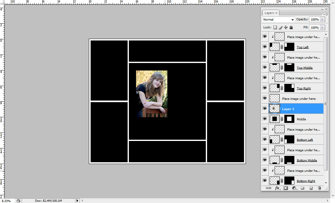
Now we get to the fun part. Go to LAYER-CREATE CLIPPING MASK with the image selected. It is important that the layer of the image is immediately on top of the shape in your layers palette. Here is what happens:


How cool is that??? Now as you can see in your layers palette, the image is completely intact; we did not crop it. In fact, you can move it around until it's in the perfect spot. You can even scale the image again while the clipping mask is applied.

Now if you have purchased one of my templates from my shop at http://phoenixdesigns.bigcartel.com/ (see how subtly I advertise?), knowing about clipping masks will help you use the storyboards.


See how the image is placed right on top of the rectangular shape I creatively named "2"? The clipping mask was already applied to the "Place image here" layer, so it snapped right into place. 

The best thing is, clipping masks are not limited to photography and shapes. In the following case I spelled the word LOVE, right clicked on the layer and the RASTERIZED THE TYPE. Then I added a plaid digital paper right on top of the LOVE layer, applied a clipping mask and here is what I got:


Cool, isn't it?

Monday, January 23, 2012

Re-sizing Images for Printing and Online Sharing

This post is directly linked to the products I offer in my online shop at http://phoenixdesigns.bigcartel.com/.

My digital shop doors opened just yesterday and I already had a bunch of questions regarding the size and resolution of the storyboard templates. So naturally I figured this topic would make an interesting and helpful blog post!

The templates I sell generally come in 300dpi and in large sizes, so they can be printed (even on big canvases) or used online (which requires re-sizing).

Let's take this template, for example, that I named "Jane" after my favorite author.


At the moment it has the following dimensions:


You can easily get to this menu by clicking the IMAGE tab and then choosing IMAGE SIZE. When you open it, yours might look a little different, because Photoshop lets you see the dimensions in inches, pixels, centimeters, and so on. By clicking the little arrows on the side you can make your selection. Let's go with pixels and inches for now. So now we have the width and height in inches, the resolution in pixels per inch, and the width and height in pixels, which is based on the resolution. If you change the resolution, the amount of pixels will change as well. 

Before splitting up the process for printing and online sharing, let me mention the three options at the bottom. When re-sizing your image or template, you definitely want all three selected and therefore the chain image visible next to the width and height. Why? Because you want to keep the proportion of your image/template:


That means that a 4x6 image should always have the same ratio. It can be 2x3, 1x1.5, 8x12, but you can't turn it into an 8x10 without cropping (which will be a totally different blog post). So for now let's just agree that we want to keep the proportions and re-sample the image, and therefore keep the three options in the menu selected.

Printing
If you want to print your photography templates (which may or may not be purchased from me) or images in general, you definitely want to check your image size. High-Quality photographic images should be printed at 300 pixels per inch (often abbreviated with ppi or dpi - dots per inch, which is more or less the same). 240 if you absolutely have to, but no less. Once you are finished adjusting you resolution (if you have to), check your dimensions. If the image is now only 4x6 inches, that's the biggest you can print. If the image is now 16x20 inches, you can print it in that size or smaller. You don't have to change the size for printing smaller at all, the lab will do that for you. But you can if you like. For practice, let's make the image 4x6 inches. Click OK. See what happens? The entire image and every layer (if you have any) have been re-sized while maintaining all proportions. 

Online Sharing
If you want people to be able to download your high resolution image, then follow the PRINTING instructions. If you want to share your image online and want to make sure no one can steal and then print it without paying you or getting your permission, then you're in the right place!

First of all, let's protect your image by lowering the resolution to 72, which is the maximum screen resolution. You won't notice a difference even if the resolution is any higher. Higher resolution images are just bigger, take longer to up-/download and therefore cause a webpage to load slower. Once you have done that, let's look at the dimensions of the image.

My computer screen at the moment is 1366x768pixels. So you don't need to post images any bigger than that, people can't see beyond their screen anyway and bigger sizes mean better quality (well, usually) and more risk to have your image stolen. If the longer side of the image is 960pixels, then that is plenty. So look at your Image Size menu. How many pixels are there, width and height? Pick the larger number and replace it with 960 (or a smaller number if you like). Click OK and you're done! Your image might seem tiny now, but it's just zoomed out. Zoom it in to 100% and you'll see that it is still big enough.

Saving
When you are ready to save your image, make sure you don't override your original template/image file. Click on FILE and then SAVE AS. If you want to keep working on the file later, save as a psd file to keep the layers. If you are ready to upload or print, save as a jpeg (which flattens the image and makes one layer out of many).


There is ONE MORE THING I'd like to mention. Let's say you just opened a template and you added an image, but it looks like this:


What now? Well, the template is obviously way bigger than the image. Unless you have a higher quality version of the image, you need to take the image out and re-size the template before using it. Right now, the template is 16x20 inches. You can re-size it using the methods explained above. 8x10 inches would be a good idea in this case, because it's still a standard print size. Or already re-size it for use online. When you are done, place the image again and now it should fit!


Does all of this sound very complicated and like a long process? Do it a couple of times and it will take all but 10 seconds. Promise.

Monday, January 16, 2012

7 Most Basic Photography Editing Steps

Every time I edit a picture I find myself repeating the same basic steps before I enhance the picture with more customized little tweaks. Since it took me over a year of using Photoshop almost every day to become somewhat proficient at it (and I still haven't finished learning all about it), I figured I'd share these simple steps with you to make the whole process a bit less intimidating! Let's go through them together while working on this image of my sister. In between each step you might want to click on Layer-Flatten Image in order to avoid confusion.


Step 1: Adjust Brightness
This image is obviously a little bit too much on the dark side. In order to fix this, go to Image-Adjustments-Brightness/Contrast and move the sliders until you think your image looks good.
In this case, I picked +32 Brightness and +10 Contrast.


Step 2: Sharpen
Unless you prefer a dreamy/hazy look, it is probably a good idea to sharpen your image at this point. Go to Filter-Sharpen-Unsharp Mask. You can play around and watch the preview to see what that does to your picture. Personally, I like to set my Amount to 18%, my Radius to 55 Pixels, and my Threshold to 1 Level.


Step 3: Adjust Levels
The colors in this image are a bit dull, so let's fix that! Go to Image-Adjustments-Levels. Now you have two options. You can either use the left and right arrow and slide them towards each other (about 5-20 steps on each side, depending on your taste and image) OR you can click on the left drop tool and select the blackest part of your image with it. Then you pick the drop tool on the right and select the whitest (blown out) part of your image. The great thing about this is that if you make a mistake and don't know how to correct it, you can just cancel the whole thing and start over.


Either way, your image should immediately look a lot more intense and less hazy.


Step 4: Remove Blemishes
Now my little sister here counts herself among the lucky teenagers who has very few problems with her skin, but upon a closer look there are a couple of tiny spots that I would eliminate before handing the image over to her - or a client. This is where the Healing Brush Tool comes in handy! You can find it on the left in Photoshop, it looks like a band-aid. With the tool selected (and the brush sized according to the blemish you wish to correct; 14 in this case) press the ALT key on your keyboard and click on a part of the skin that is close to a blemish, has a similar color, but is clear. Now you've saved that part of the skin as a sample and you can easily replace any blemish with it simply by clicking on it (the blemish, that is)! Very easy and quick. As soon as you move on to a differently colored area of the skin, pick a new skin sample to base the "transformation" on, so you avoid differently colored spots all over the person's face.


Step 5: Adjust the Color Temperature
Since my sister was sitting in the shade, the image looks a bit cold. In fact, it was freezing outside, but she insisted on wearing short sleeves for this. In order to make the image more appealing, let's give it a nice sunshiny look! Clicking on Image-Adjustments-Color Balance will do just that. A window will open up for you to play with. Right now the Midtones are selected. By moving the sliders you can now adjust the midtones and make them a bit more yellow, red, and magenta. Now click on shadows, which will affect the darkest areas of your image (the green bushes in the background, for example). I wanted the green to be a bit more prominent, so that's where the slider went - just a bit, we don't want her to look sick. :) The highlights will deal with, well, the light areas of the image, like her skin. I added a bit of yellow to fake sunshine and a pinch of cyan to get rid of the redness on her nose (it was COLD). 


After doing all of this, here is what the image looks like:


Step 6: Pop the Eyes
Now I am going to tell you how to make eyes really pop... BUT you need to make sure you use this "secret" sparingly. No alien-eyes, please! After all, we edit in order to enhance beauty, not to make a person look unnatural and photoshopped... It's like make-up, you want it to look like you are wearing none. :) Our first step is to use the magnetic lasso tool to select the iris in each eye. After selecting the first one, you can press and hold the SHIFT key to add another selection without losing the first one.


Now right click on the image with the tool still selected and pick "layer via copy". You now have a separate layer that only contains the eyes. With that layer selected, go to Filters-Other-High Pass and choose 9 pixels. Now change the blending mode (on top of the layers) from "normal" to "soft light" or "overlay" (again, be careful, we don't want alien eyes). With the "Sponge" tool on the left (set to "saturate", not "desaturate") you can pop the color of the eyes a bit, too. It's a slight difference, but very powerful! If you like you can now also use a soft white brush at about 15% opacity and paint on the white in the eyes. Just a bit.

Step 7: Remove Eye-Bags
Another thing I like to do is to remove/soften the bags some people have under their eyes. Sometimes the healing brush I described earlier works well, but you can also use a brush for a similar effect. First, you need to right-click on your background layer and duplicate it. With the new layer selected, use a brush tool roughly the size of the iris in the image. Click on the ALT key and hold it; your cursor has now turned into the eyedropper tool. Select a color close to the person's eyes, but not as dark as the eye-bags. Now change the brush opacity to about 20% and simply color over the bags (and other parts of the skin, if you like)! By adjusting the layer opacity you can now lessen the effect if the skin looks too soft.


After these 7 little steps, check out the difference (please forgive the fuzziness, this is re-sized for protection):


And because these steps are a bit time-consuming, the nice people of Photoshop have enabled us to create Actions that do a bunch of this and much more for us at a fraction of the time! :)

Hope this helped and I'd love to read your comments if you have something to add or alter!

Sunday, January 15, 2012

How to use Photoshop Actions

Load your Actions into Photoshop:
Open your version of Adobe Photoshop. In the Actions Palette (if you don’t see it, go to the WINDOWS tab and select ACTIONS) there is a small arrow in the top right corner. Click on it and select LOAD ACTIONS. Now find the folder you saved your Actions in and double-click on the one you would like to load (my Actions are generally in a folder called Photoshop on my Desktop). The Actions you selected should now appear in your actions palette.


Use your Actions:
When you purchase actions, they generally come in a set of several actions related to each other in some way. All of the actions from the set you just loaded into Photoshop are now ready to use. First, you open an image. If the image is layered, make sure the correct layer is selected in the layers palette. Typically, you want to apply the action to the image itself, so make sure BACKGROUND is selected. Then you click on one of the actions from your set. At the bottom of your Actions Palette there is a triangle, similar to the PLAY button you see on music players. Click on it. Your action should now run! When it is done, click on the new folder or layer above your Background layer and adjust its opacity to your taste.


Choose the right Action for your image:
Each Action affects an image in a different way and not every Action will work with every picture (well, it’ll work, but it won’t always get fantastic results). Before choosing an action I look at the image I am working on very closely. What colors are most prominent in the image? Which colors do I want to enhance? Does the image already have vibrant colors or is it rather dull? Depending on how I answer these questions I choose the Actions I want to try out.

Let’s go through this process with an example.


This image right here is SOOC (straight out of camera; no editing done yet). The most prominent colors seem to be the pink of the girl’s sweater, the blue of her pants, the green in the background, and maybe the light colors of her hair and skin. To me the background seems boring, because the green color is very dull, so that is definitely something I would like to enhance. So I want to pick an Action that affects all of these colors.

DREAMY, an action I recently created, seems to do just that. Here is what the image looks like after that action is applied:


It definitely enhanced the green, pink, and the girl’s skin and hair colors. Personally, for this image I would prefer a less dreamy (ha!) and hazy edit, though. So another action that jumps out at me would be GREEN LANTERN. Let’s see how that turns out:


Now I don’t know how you feel, but this action pretty much nailed what I wanted to do with the image. A couple of more little tweaks here and there, maybe brighten it up a bit, and I’ll be done with the edit!

Please Note: This part of the process is really just a guideline. Feel free to test out any Action on any image. You can even use more than one Action and see how they work together at different opacities. The results might be amazing!

Customize your new Actions:
While most of my Actions brighten the image up a little bit, it depends on each image how much light, for example, has to be added. You can tweak each aspect of your Action by clicking on the newly created folder or layer above your Background in the Layers Palette. If it is a layer, just adjust the opacity or use a separate action or your own steps to brighten/darken (in this case). If it is a folder, click on the little triangle in between the folder and eye symbols. The folder now opens and reveals its content. Each layer should be nicely labeled. Find the one that affects the aspect you’d like to tweak (Lighten, in our case), and change the opacity until it works for your image. You can play around with any of the layers and see how they affect your image.